TRADITIONALBOOKFALL 2018 // PAGE LAYOUT DESIGN
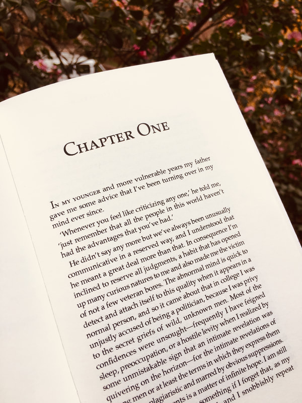
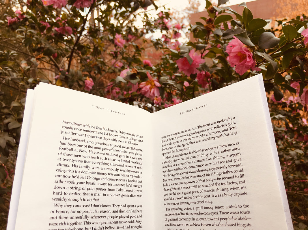
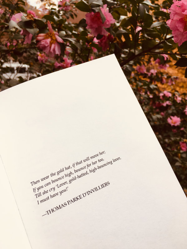
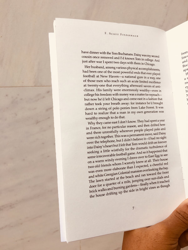
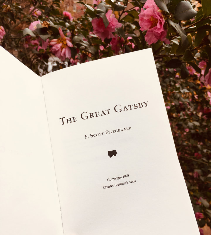
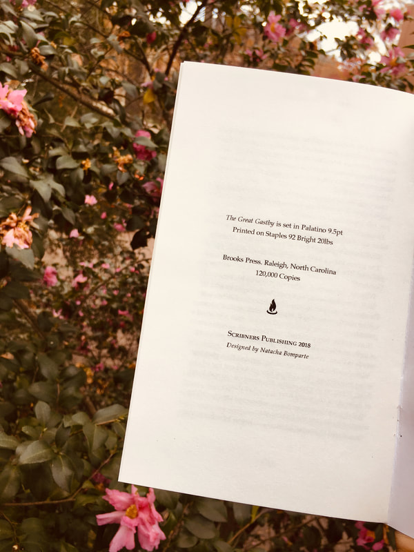
[Brief] Design a grid system for a traditional book. Made with Adobe InDesign.
[Book size] 5in x 8in with a 0.5in margin on all sides. [Typeface Considerations] Bembo, Sabon, Athelas, Hoefler Text, Palatino (for final) [Concepts] Master pages, grid systems, canon, justification, small caps, colophon [Challenges] Settling on a typeface was the pitfall and success of this project. Initially, I didn't pair any significance with the fonts. The typeface choice became difficult after realizing that I needed to choose a font that would accommodate the tone of the text and the grid system. With research and a series of test prints, Palatino became the suitable typeface for the classy yet dramatic story of the Great Gatsby. |
NATACHA BOMPARTE 2019
