INFOGRAPHICSPRING 2019 // DIGITAL LAYOUT DESIGN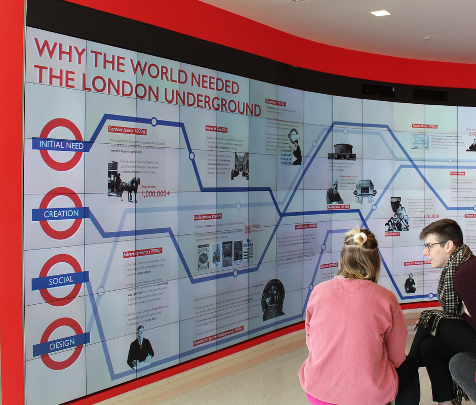
[view full size]
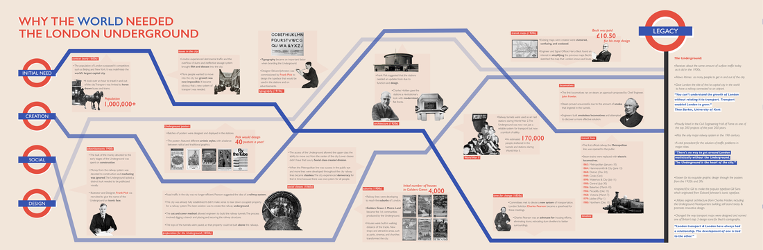
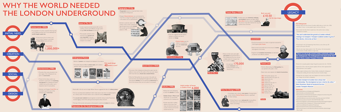
[Brief] Choose a pivotal moment in history and develop a non-linear infographic
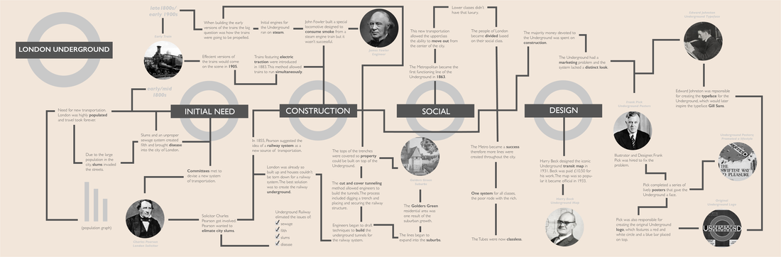
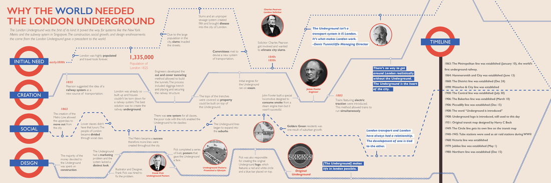
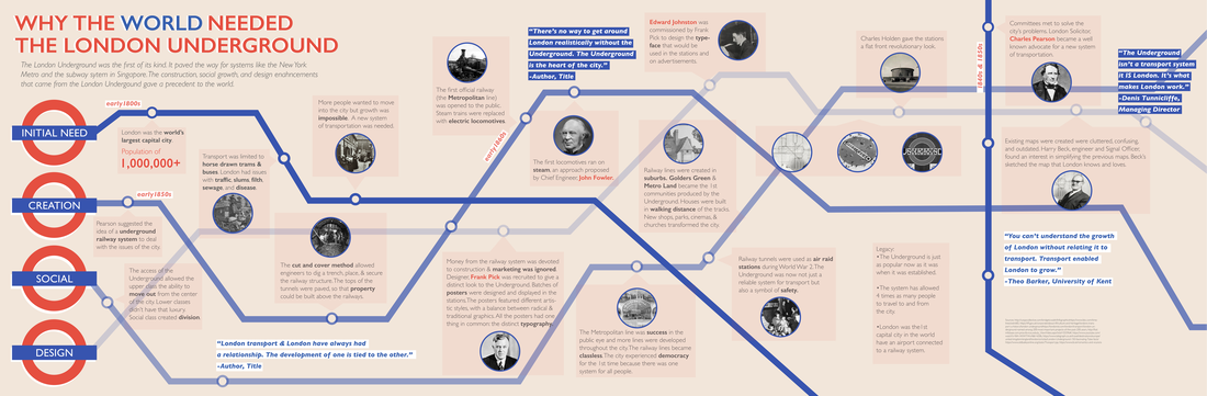
that highlights cause and effect relationships within four weeks. Made with Adobe InDesign and Photoshop. [Challenges] Research: For this project I believe I spent more time finding facts than I did designing. From start to finish, the creation of the Underground spanned across 100 years. In order to make the history of the system digestible, I divided the information into five sections. Text Size: At 21ft x 7ft this assignment has been my biggest physical project to date. My initial drafts featured type that was triple the point size necessary. Viewing my document in its Actual Size and printing out sections of the document was beneficial. Layout Decisions: We were tasked to design a non linear layout that would allow the reader to choose their way of navigating without getting confused. I used the transit lines of the Underground to create dynamic guiding paths. Readability: The viewer is first encounters the title of the infographic. The viewer can experience the infographic by starting at any one of the five sections. The circles along the transit lines indicate call out boxes. Above each call out box is a topic (highlighted in red). Text is displayed in 1-2 sentence segments instead of paragraphs of copy. Bolded, enlarged, and red words add another level of hierarchy. |
NATACHA BOMPARTE 2019
